


Adresse
1 rue de Saint-Petersbourg75008 Paris
Mail
contact@bam.techTéléphone
+33 (0)1 53 24 00 83
As React Native developers, we may be tempted to use the height property when styling our components to ensure a pixel-perfect design. But this may lead to a lot of design issues. In this article, I will try to answer the two following questions :
One of my first tasks as a mobile developer was to create a custom button. At the time, I decided to set the height of my component to respect the provided design as shown in the code below:
At the time I developed my custom button, I unfortunately did not test it with different font size preferences. In fact, both on Android and iOS, the user can define a font size preference in the phone’s settings (and based on it, the texts will be bigger or smaller than their original size). Testing mobile applications with different font size preferences is very important, since both developers and QA teams tend to forget this feature and assume that the application will work fine for all font size preferences.
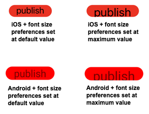
The figure below shows how the custom button is rendered both on Android and iOS using different font size preferences. It comes out that the text is cropped for big font size preferences and that the button does not adapt its height.
Unlike what React Native's style syntax suggests by abstracting all units of measurement, the ++code>fontSize++/code> and ++code>height++/code> properties do not have the same measurement unit at all. For example, on Android, the ++code>fontSize++/code> property uses the Scale-independent Pixels (SP) by default, but the ++code>height++/code> property uses the Density-independent Pixel (DP).
SPs and DPs are both density independent measurement units, which means that they will be adapted according to the device’s resolution, the only difference is that SPs are also scaled by the user’s font size preference (more information about these units can be found in the android docs). And that explains that our button’s height did not change when font size preference has changed in the previous example, since it uses the DPs.
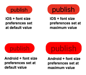
Let’s now use padding instead of height for our component (by replacing the ++code>height: 32++/code> with ++code>paddingVertical: 3++/code>). It comes out that our component is now perfectly scalable, as shown in the figure below. So, always use paddings (or margins) whenever it’s possible to style your components.
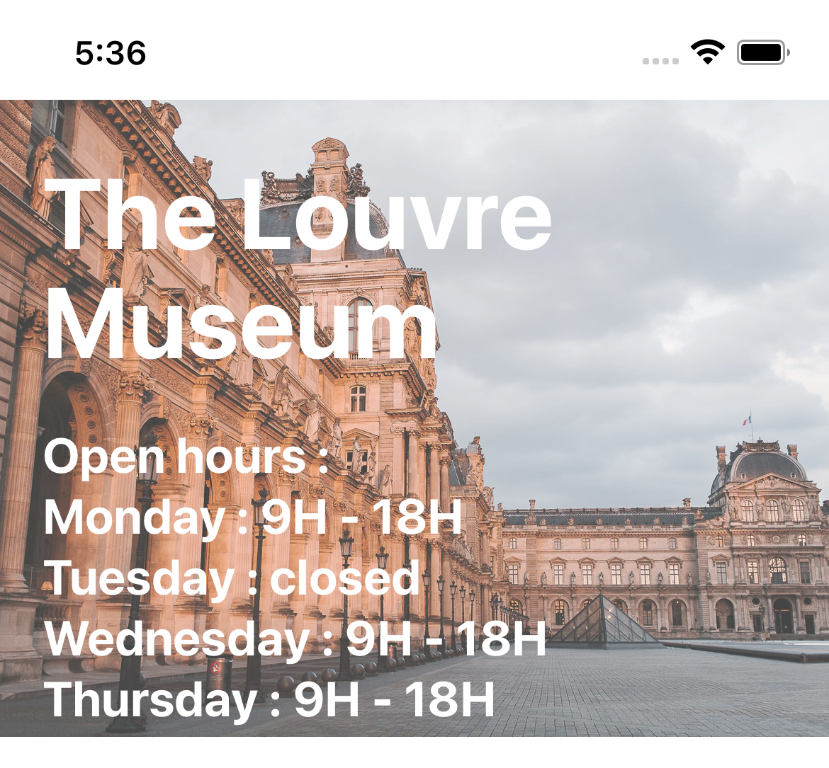
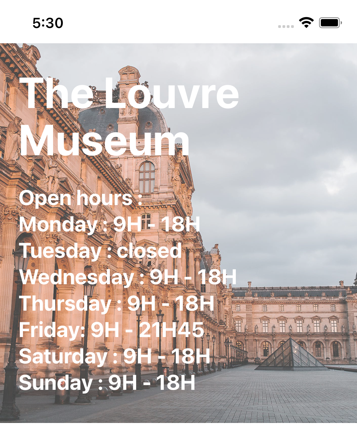
In some cases, we may have to set the height of our React Native component. For instance, this is usually the case for images. So let’s take the example of an image component with a text over it as shown in the figure below.
This is a classic example that can be done using the absolute position for the texts’ container, as shown in the snippet of code below.
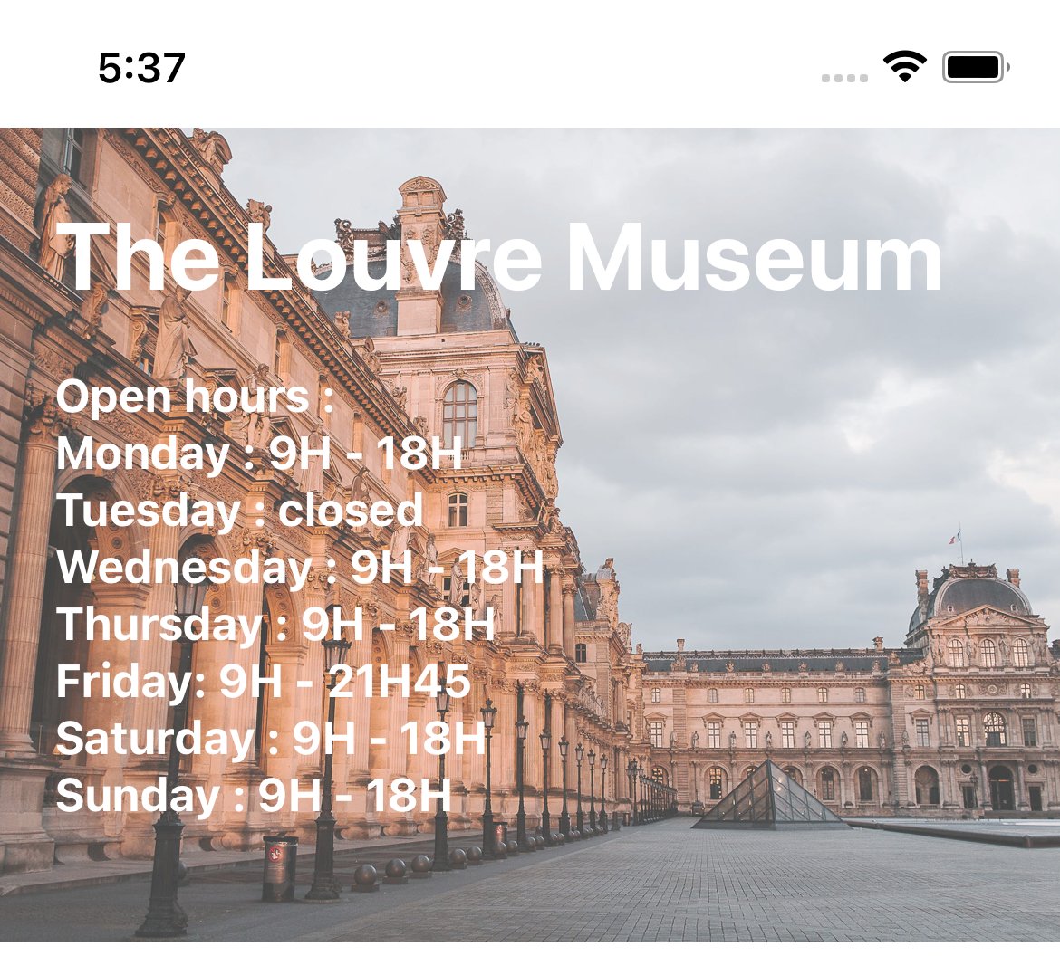
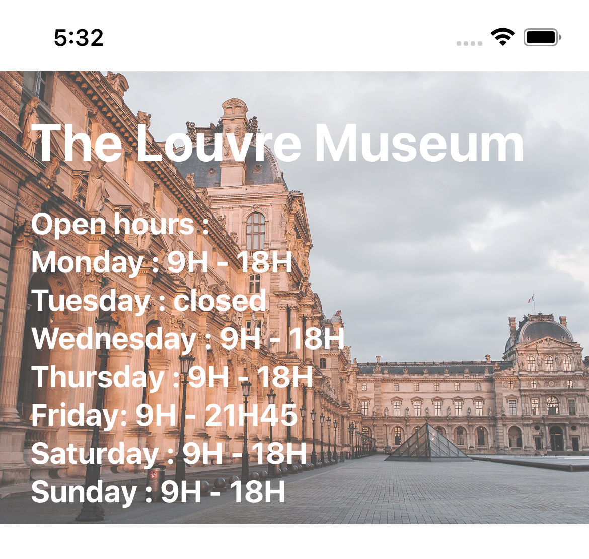
Let’s see how our component is rendered with bigger font size preferences. The figure below shows that the result is not so perfect : the open hours are cropped in the bottom of the image and thus the information is incomplete.
In the next paragraphs, I will try to give some hints/ tricks, in how to make sure that our component is rendered correctly even for bigger font size preferences. This is very important since it makes your application more accessible, especially to people with visual impairments who need to enlarge the font size. Those hints may not be relevant for all use cases, but can be considered as ideas to help style React Native component with fixed height.
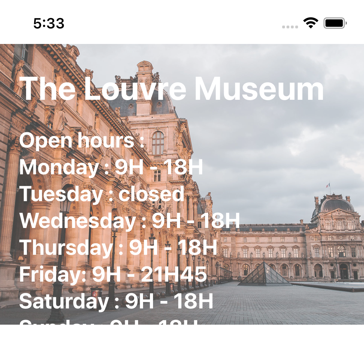
It’s obvious that one of the problems with the previous picture is that the title is rendered into two lines. In order to fix that, the ++code>numberOfLines++/code> property can be used to set a maximum number of lines for the title.
After this modification, the text takes only one line but is cropped.
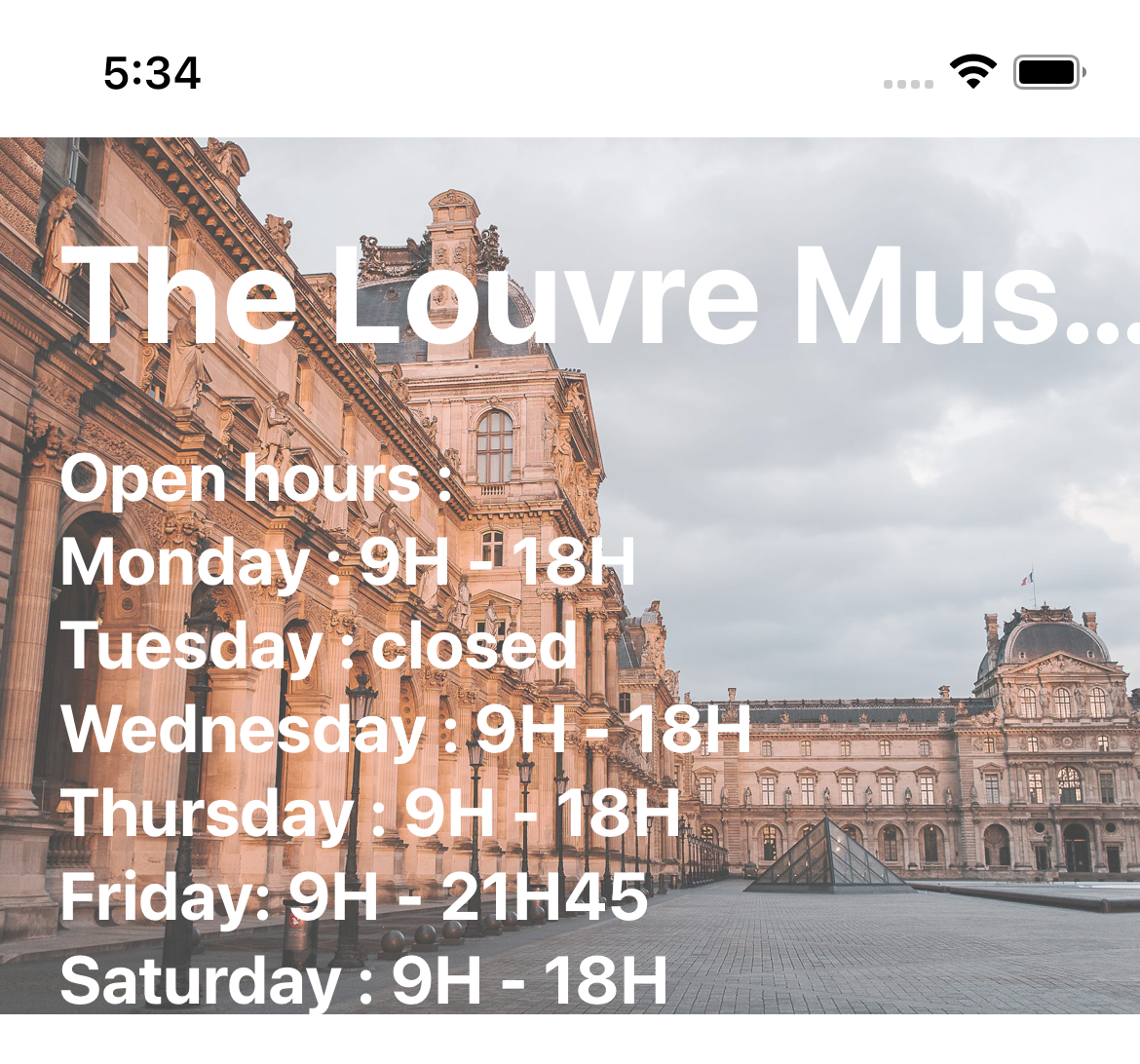
Suppose now that we want absolutely to see the full title. One option is to make sure that our title is not scalable with the font size preference set by the user. This can be done by setting the ++code>allowFontScaling++/code> property to false (in that case, the ++code>fontSize++/code> property will use the DPs instead of SPs). Be careful, The use of this property should be done with precaution, especially for small texts since it may alter the user experience.
We can see that even after disabling the title’s scaling, the open hours text is still truncated. Since our original open hours text is a little small, we prefer not to use the ++code>allowFontScaling++/code> again. In order to avoid the open hours being cropped, we can set a limit for the font size multiplier so that text will always be visible by the user. This can be achieved using the ++code>maxFontSizeMultiplier++/code> property. After setting the latter to 1.2, we can see that the text is now entirely visible ! (again this should be done with precaution since it may alter the user experience. )
And good news, the result is the same on Android !
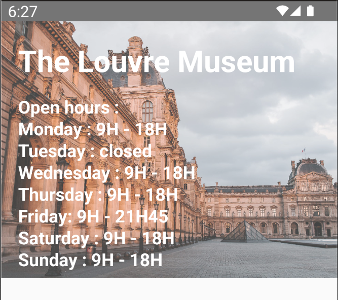
This solution is very specific to the use case of an image with a text over it, and that’s why I left it to the end. In fact, unlike the Image component, the ImageBackground component accepts children and will adjust its height to the size of its children. The figure below shows the result when using the ImageBackground for big font size preference.
It comes out that the text is perfectly scalable, but the image is a little cropped on the right. For our use case, this is not really important (the most important is that the user has access to the open hours of the Louvre Museum) but for other uses cases, the image being cropped or the aspect ratio changing may also alter the user experience since the image is also a part of the information that we want to present to the user.
Thanks for reading me so far ! I hope that you will be more precautious when setting the height of your React Native components. Always remember to :
Now that you've read this article, try to change the font size preference of your phone and test your phone applications, you'll be quite surprised when you see cropped texts in applications that you use every day.


Le BAM Innovation Lab, pour rester à la pointe des dernières innovations tech et produit !


