


Adresse
1 rue de Saint-Petersbourg75008 Paris
Mail
contact@bam.techTéléphone
+33 (0)1 53 24 00 83
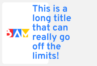
Many of us, coding a React Native app, have already been in this situation: « Why on Earth my text refuses to wrap properly? ? »

A React Native text going off screen
What's our first reflex as developer? Go ask Google. And the first result we found is this StackOverflow answer :
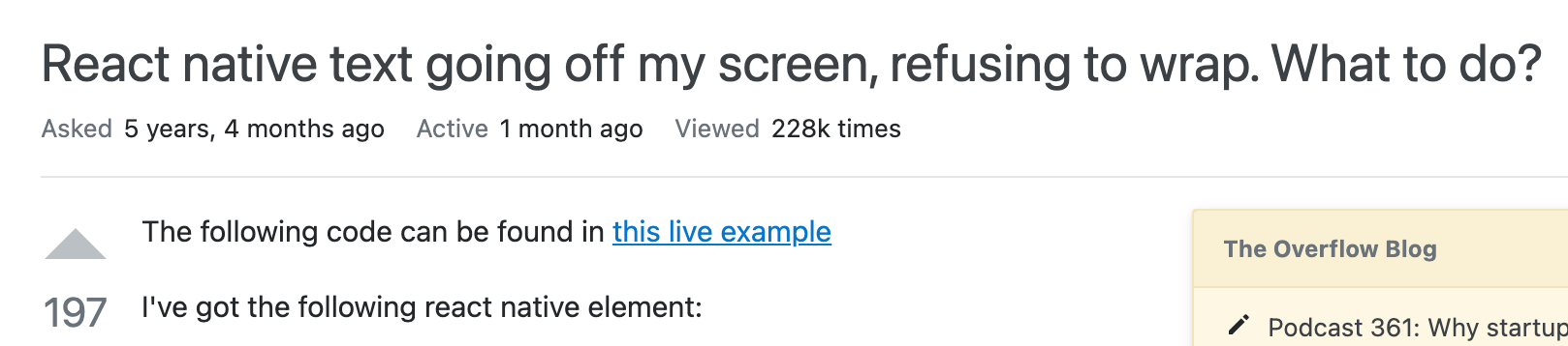
"React native text going off my screen, refusing to wrap. What to do?"
The solution provided is to add a style ++code>{{ flex:1, flexWrap: 'wrap' }}++/code> on the ++code>Text ++/code>element :

StackOverflow first answer to our Problem
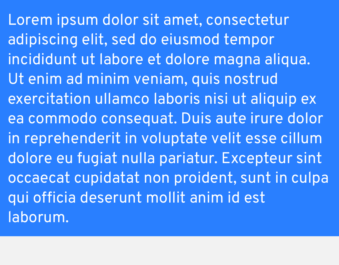
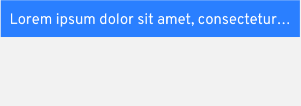
It works! ? The text does not overflow out of the screen anymore. Here you can see the before and after:
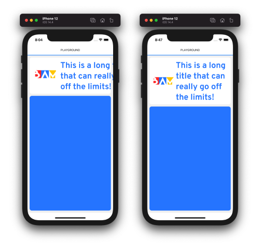
Before and After
But... I did not understand why.
A short edit appears after :
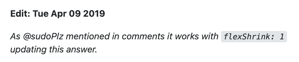
StackOverflow Edit
Again, it's working: ++code>flexShrink++/code> seems to be enough to maintain the text in its container ?.
But more than just fixing my bug, I wanted to understand what was happening. Several explanations came to me, but none I was sure about. And I had even more questions: "Why just flexShrink, what happened to flexGrow? Do I really have to add a flexWrap:wrap before? Should I add "flex:1" on literally every text in my app just to be sure, because it's so efficient ??? And most importantly, is there something else important that I am missing about React Native blocks? Something that could provoque the same bug, in slightly different situations?.."

My Brain after fixing the going-out Text
without understanding what I did
You see, it made a lot of reasons to want to solve this mystery. And after some exploration, I happily announce you that I solved it! ? I'll explain everything in this article:
1. First why is the StackOverflow fix working
2. Then, more interestingly, I explain why was the Text going off screen in the first place
This article does not require an extended developer experience to be understood. You will need:
- Basic knowledge of React Native / Javascript
- Basic knowledge of Flexbox Layout
Here is a React Native code that allows to reproduce the bug ?:
++pre>++code>import React, { FunctionComponent } from 'react';
import { Image, StyleSheet, Text, View } from 'react-native';
export const TestScreen: FunctionComponent = () => {
return (
<View>
<View style={styles.titleContainer}><Image style={styles.logo} source={require('./logo.png')} />
<Text>
{'This is a long title that can really go off the limits!'}.
</Text>
</View>
</View>
)};
const styles = StyleSheet.create({
titleContainer: {
flexDirection: 'row',
},
logo: {
width: 100,
},
})
++/code>++/pre>
Note: You can play around with the code; to obtain the screenshot, I
used some extra padding, colors and radiuses. But they are not impacting for the study: everything essential is above.

Basically, what we have is a++code> Text++/code> in a row container, with an icon before. The row container is itself in a classic vertical ++code>View++/code>. The Text is wrapping, but not enough so we can see it entirely.
In the Flexbox layout, ++code>flex: 1++/code> is a shortcut for 3 style properties:
We won't discuss the ++code>flexBasis++/code> property in this article, as it has no impact in the problem. But the two others interests us.
Note: If you need a reminder about Flexbox properties,
I recommend this article on CSS-Tricks: clear and well illustrated, made for web CSS but really useful for React Native too.
I used to believe that it was because of the ++code>flexGrow++/code> part that ++code>flex: 1++/code> worked; we had to allow the element to grow vertically, so the text could gently wrap in a wider space? Nice mental model, but it's wrong!
++code>flexGrow++/code> (and ++code>flexShrink++/code>) controls the size of an item along what is usually called the main axis of the container (see the React Native doc): in our case, horizontally.
Here is a drawing that helped me fix the idea:
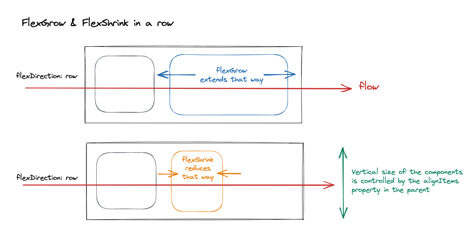
FlexGrow & FlexShrink in a Row
Note: I rather use the words "flow" than "main axis" to talk about the direction where the elements align: I find it more illustrative.
This scheme illustrates why ++code>flexShrink: 1++/code> is the only important part: it allows the title to take a smaller width than its initial size.
I hadn't focused on that at first sight, because I was only seeing the height growing...forgetting the width shrinking, when it was actually the part we were controlling!
So the text was just too large at the first place. At least at this point, I understood why it was going off screen: it's the normal ++code>flexWrap : no-wrap++/code> behavior of an element (here, the ++code>title++/code>) inside a parent row view (the ++code>titleContainer++/code>).
When elements are bigger than their parent, they start to overflow them :
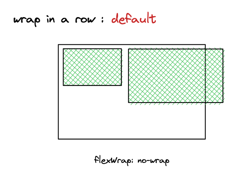
Children overflowing in a Row
If the parent has the screen's dimension, elements overflow outside the screen and we don't see them anymore.
We can force them to wrap by using the ++code>flexWrap++/code> property:

Children wrapping in a Row
But... why was the initial text too large in the first place? Why did we have to make it shrink?
This is the second question I asked myself, and the answer was trickier than I thought.
To answer this question, we "simply" have to answer to the most fundamental question in layout: How the size of an element is computed when it's not explicitly fixed in its style?
I like to think there is 2 ways, and 2 ways only, to understand how an element compute its width and height, when not given:
This is my favorite mental model when talking about Layout. It really allows to understand quickly what goes on screen.
I will apply it to our ++code>title++/code> element, following its two characteristics:
I used to think that a ++code>Text++/code> was like a ++code>View++/code> with ++code>flexDirection: row++/code>, and all of its words being tiny++code> Views++/code> separated by spaces.
In this model, we could have had all the words making a really long line, without wrapping at all. The first StackOverflow answer implicitly refers to this model, when suggesting to add++code> flexWrap: wrap++/code> to fix the problem.
This description fits for words magnets on fridge, but...not for a React Native text.

React Native Text is not made with Fridge Magnets!
Because if we re-read the React Native documentation:
The <Text> element is unique relative to layout: everything inside is no longer using the Flexbox layout but using text layout. This means that elements inside of a <Text> are no longer rectangles, but wrap when they see the end of the line.
A ++code>Text++/code> always wraps. At least as soon as it is long enough. There is no need to add a ++code>flexWrap++/code> property: the StackOverflow answer is partially wrong for this.
In our mental model, it means:


So by default, a long text is never able to compute its width on its own.
Unless using absolute position, it's always given by its parent.
This point is important for what's coming next.
Our title is not only a ++code>Text++/code>, but also a child in a ++code>View++/code> that uses the Flexbox layout. Given this, how is its size computed?
Once again, the parent vs content-driven model helped me to understand what was happening; I'll expose it to you here. I start with a classic ++code>View++/code> in column, because I find it easier to get:
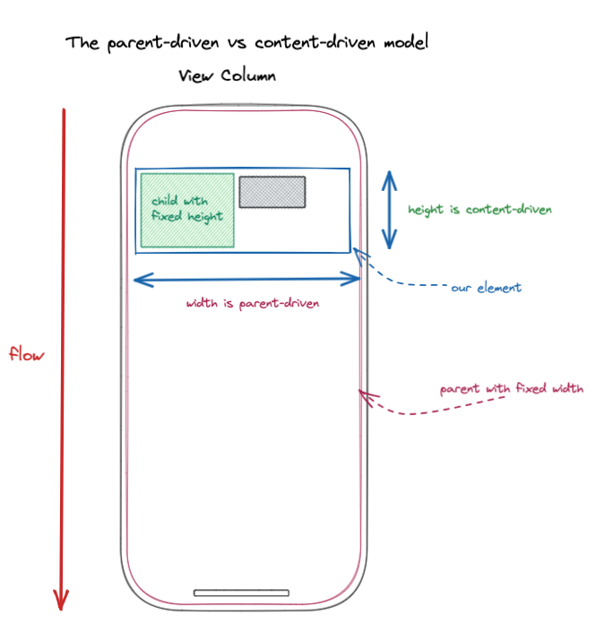
Analyzing an Element in a column View
The blue element has a parent-driven width. It also has a content-driven height: fits to what is inside only.
If we transpose it exactly in a ++code>View++/code> with a row layout:

Analyzing an Element in a row View
So our title, as an element in a row, does not take its parent into account for its width. It follows only its content.
And...we arrive to a problem.
If we resume what we learned above about our title:
.....So....What now ?

The "No it's you!!" Fight
The React Native answer is pure and simple:
A ++code>Text++/code> always takes its parent's width
Even in a row container. Even if ++code>flexGrow++/code> is not set to 1, which is the official way to force an element to reach its parent size.
Note: To be precise, it's not exactly its parent's width: it's the size the ++code>Text++/code> would have had if it had been alone in its container. It means if there is a padding inside the parent, the ++code>Text++/code> width will be its parent width minus the padding.
In our case, the ++code>title++/code> element always takes the ++code>titleContainer++/code> width, even with the icon before. It becomes obvious when we drastically reduce the ++code>titleContainer++/code> width: see what happens to the title!
The Text-In-A-Row follows its parent's Width!
But Text-In-A-Row certainly keeps some of the Element-In-A-Row properties : it still ignores completely its row siblings, and goes out of bounds regularly. It just takes its parent width, and then lives its life on its own...
...until someone tells him to stop with a good old ++code>flexShrink: 1++/code>.

A ++code>flexShrink ++/code>ordering a Text to behave,
look at its Siblings and reduce its Size, finally!
And here we are, at the end of our journey; back to the StackOverflow pure answer - hopefully, with a better understanding of the elements we use.
Thank's for reading me so far! I hope you enjoyed following my deductions and discoveries in React Native layout. Now you also know the "Truth" about React Native Text...it always takes its parent's size, even when there is other siblings around! But if you had to remember one thing, it's the parent vs content-driven model: really, it's the best way to solve a ++code>flexbox ++/code>mystery. Stay tuned, because it may not be the last time you hear about it!


Le BAM Innovation Lab, pour rester à la pointe des dernières innovations tech et produit !


