


Adresse
1 rue de Saint-Petersbourg75008 Paris
Mail
contact@bam.techTéléphone
+33 (0)1 53 24 00 83
“Let's focus on MVP features, will see animation later.”
Does it sound like something you could say to your customer? At the end, either you deprioritise the animation and never do it or you spend 3 days searching for a solution, deprioritise the animation and never do it.
But, did you know that some of those animations can be implemented with just one line of code? In this article, I will present you 5 animations made easy!
The library used for the given examples is react-native-reanimated. You will thus need to install it before implementing any of them.
%20(4)%20(2).gif)
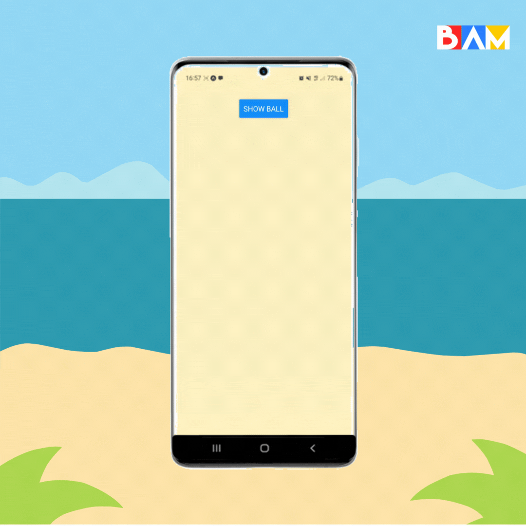
Implementing a toaster is one of the simplest animation ever.
++pre>++code class="language-typescript">import Animated from "react-native-reanimated";
const Toaster = () => {
return (
<Animated.View
entering={FadeInUp}
exiting={FadeOutUp}
>
lorem ipsum
</Animated.View>
);
};
++/pre>++/code>
Instead of a simple View, use Animated.View from react-native-reanimated. That allows you to use the different tools of the library such as layout animations on a component similar to a View. Then, add entering and exiting properties with the animation you want to use on mount and unmount.
👉 Link snack expo: https://snack.expo.dev/@nicolasw/toaster-animation
%20(1)%20(2).gif)
The progress bar consists in the animation of a view’s style.
++pre>++code class="language-typescript">import Animated, {
useAnimatedStyle,
withTiming,
} from 'react-native-reanimated';
const ProgressBar = ({ progress }: { progress: number }) => {
const animatedStyle = useAnimatedStyle(() => ({
width: withTiming(progress + '%', { duration: 1000 }),
}));
return (
<Animated.View style={animatedStyle} />
);
}; ++/pre>++/code>
The hook useAnimatedStyle provided by react-native-reanimated allows you to animate styled properties. Use its result as a style on an animated component (Animated.View, Animated.Text, …).
Paired with withTiming, the animation lasts for the duration given as parameter and you obtain a smooth transition from a point A to a point B.
👉 Link snack expo: https://snack.expo.dev/@nicolasw/progress-bar
%20(1).gif)
Similarly to the progress bar, the loading skeleton animates its style.
++pre>++code class="language-typescript">const animatedStyle = useAnimatedStyle(() => ({
opacity: withDelay(
2000 * Math.random(),
withRepeat(
withSequence(
withTiming(0.4, { duration: 1000 }),
withTiming(1, { duration: 1000 })
),
-1,
true,
),
),
})) ++/pre>++/code>
Whilst animating the opacity, use the combination of three utils:
👉 Link snack expo: https://snack.expo.dev/@lucieu/loading-skeleton
.gif)
Reuse what you previously learned about animating your style and the different utils on an adjacent view or image of your component to create a glow effect.
++pre>++code>import Animated, {
useAnimatedStyle,
withRepeat,
withSequence,
withTiming,
} from 'react-native-reanimated';
const styles = StyleSheet.create({
glowContainer: {
justifyContent: 'center',
alignItems: 'center',
position: 'absolute',
top: 8,
bottom: 0,
left: 0,
right: 4,
},
});
const GlowingSun = () => {
const glowAnimation = useAnimatedStyle(() => ({
transform: [
{
scale: withRepeat(
withSequence(
withTiming(1.2, { duration: 1500 }),
withTiming(1.6, { duration: 1500 })
),
-1,
true
),
},
],
}));
return (
<>
<Animated.View style={[styles.glowContainer, glowAnimation]}>
<Image
source={require('./image-glow.png')}
style={styles.image}
/>
</Animated.View>
<Image source={require('./image.png')} style={styles.image} />
</>
);
}; ++/pre>++/code>
The idea is to alternate between enlarging (scale 1.6) and reducing (scale 1.2) this secondary view infinitely.
👉 Link snack expo: https://snack.expo.dev/@nicolasw/glowing-sun
++pre>++code class="language-typescript">const animatedStyles = useAnimatedStyle(() => {
return {
transform: [
{
scale:
withSequence(
withTiming(2.5, { duration: 100 }),
withSpring(1.0)
),
},
],
};
}); ++/pre>++/code>
Introducing a new util: withSpring. It is what gives the animation a bouncing effect. You can combine it with an entering animation and withTiming util to make it smoother.
👉 Link snack expo: https://snack.expo.dev/@nicolasw/bounce
You may have guessed it:
You can animate loads of different components just with the basics. Just play with it to find the perfect effect your designer asked!


Le BAM Innovation Lab, pour rester à la pointe des dernières innovations tech et produit !


