


Adresse
1 rue de Saint-Petersbourg75008 Paris
Mail
contact@bam.techTéléphone
+33 (0)1 53 24 00 83
Creating a great user experience (UX) with a beautiful design (UI) sometimes seems like a magic process for the uninitiated. However, even if we seem like apprentice magicians playing randomly with colors and shapes, UXs still respect certain specific principles concerning the composition of their screens.
The main job of a designer is to produce the visual elements of sites or mobile applications. With technological advances and the growth in the number of mobile applications, user experience and design have become the two main assets of standout applications. However, you don't build big things without laying a good foundation. Thus, any self-respecting application must obey certain composition principles that allow fluidity and pleasantness (Note that these principles are also applicable to other media tools).
Balance is the way in which the various elements are distributed on the screens. Good balance normally ensures a stable and smooth design. Nevertheless, many designers choose asymmetry to offer dynamism while differentiating their creation from their competitors. But apprentice-designers be careful! Asymmetry is more difficult to manage than symmetry and you run the risk of losing all visibility on your screen. You must therefore remain visible by prioritizing and organizing your elements (see principle 5: the circle is complete).
A design can play with three types of symmetry:
The choice of symmetry varies according to the message to be conveyed. In general, if several elements are to be highlighted, axial symmetry seems appropriate. To reinforce a hierarchy between elements, you can use approximate symmetry.
Paypal: Approximate vertical and horizontal axial symmetry
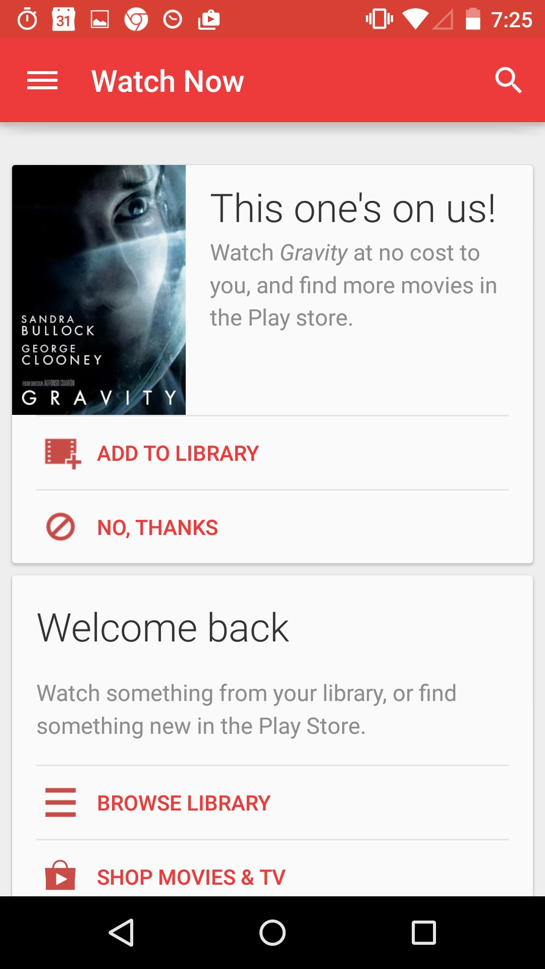
Rolo chooses a central symmetry to reinforce the image of the passage of time.
Ordering graphic elements visually in a hierarchical manner allows you to prioritize some elements over others. A logo or a footer, for example, do not have the same importance and should therefore be prioritized differently.
There are three types of priorities:
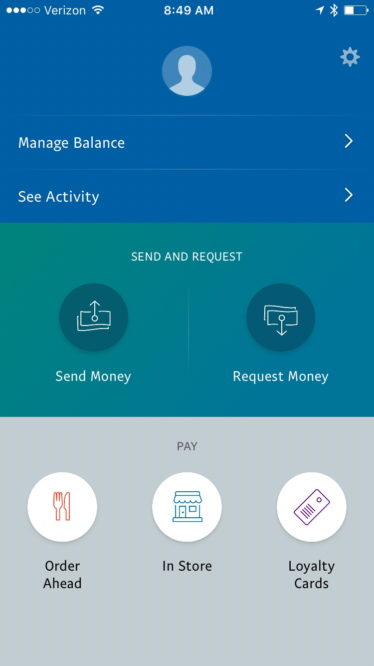
Google Play Store draws the user's attention to the movie GRAVITY and pushes it into action with its clearly visible “ADD TO LIBRARY” and “NO, THANKS” buttons. Then the “Welcome Back” mode is highlighted, and finally, the menu and the other options.
The proportions are essential to respect the balance of the elements in relation to each other (they are therefore strongly linked to principle No. 2). It is no surprise to anyone that the largest elements of a screen will have a stronger impact on the user than the smaller elements. Combined with hierarchy, this principle allows the user to easily access the information that you want to put first. The aim of a good proportion is therefore to allow the content of the screen to remain consistent in terms of the dimensions of elements of equal importance.
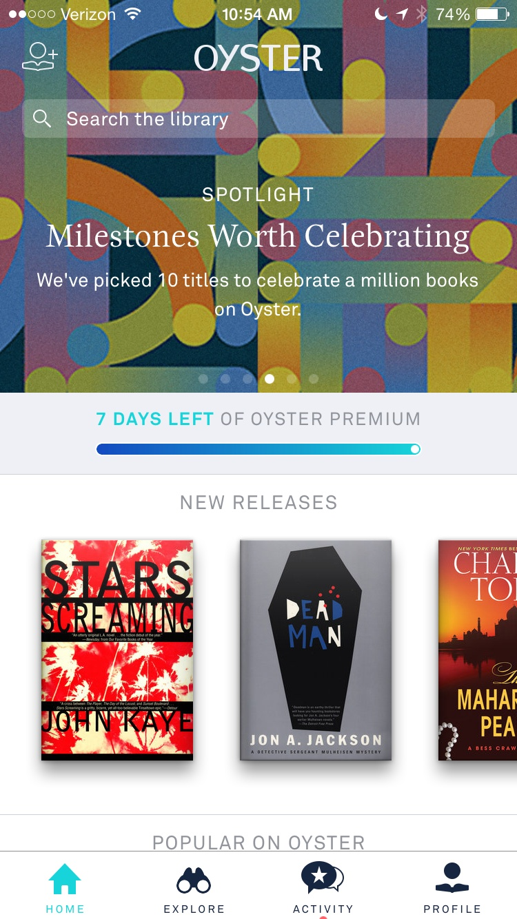
The OYSTER application organizes its screen according to the proportion of the various elements. The header, clearly visible, is bigger than the other visual elements that are all proportionate to each other.
We talk less often about rhythm in design than in music, yet it complements the dynamism of the screen just as well. Can you imagine music without rhythm? Not very interesting right? (We won't get into the debate on “Does music without rhythm exist?”). Rhythm represents what moves the user's eye from one element to another. Thanks to rhythm, UX ensures that the user will look at the elements in the order they want them to follow. Well, that doesn't mean it works all the time. As was stated at the beginning of this article, UXs are not magicians, they cannot control all the reactions of their users. So, in fact, as everyone attaches importance to different things (= we are all different), UX is never 100% sure that the pace will be respected. However, pace is still an important factor to always take into account.
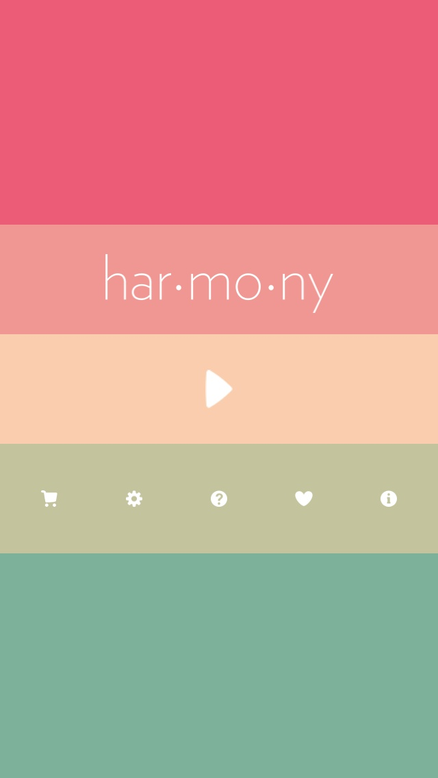
The Harmony application plays with colors to give rhythm to its home page.

Snapguide offers a rhythmic screen that encourages the user to focus first on “Soups for All” and then on the other elements (Featured Guides and the header).
The four previous principles work together to build the visibility of design. Visibility itself is meant to make important design elements as easy to find as an elephant in a haystack. So balance, hierarchy, proportions and rhythm all aim, in the end, to make screens more visible. Without hierarchy or rhythm, with all the graphic elements at the same level and equally important, there is no visibility. The most important thing to remember when creating a visible screen is to always keep in mind what you expect from your user. The most important functionalities of the application should therefore always be visible.
Now that you have the principles, what is not working on this screen?


Subscribe ot our newsletter to stay on top of the latest tech and product innovations!


